Control Elements. Creating user defined dialog boxes


Control Elements. Creating user defined dialog boxes |
|
When working with parametric models and while building an assembly, the user often needs to edit the values of external variables of the models being designed or fragments being a part of an assembly. The T-FLEX CAD general variable editor can be used for handling external variables. However, it is much easier and simpler to work with specially created custom dialogs containing Windows-native tools (input boxes, drop-down lists, "Yes/No" switches, etc.).
A custom user-defined dialog provides a quite convenient and easy way of editing variables in a parametric model. It is developed by the user when creating a model or fragment. Special T-FLEX CAD system elements, namely, control elements, are used for creating a custom dialog. When creating a dialog, the developer can make it clear and easy to use by adding necessary explanations and comments in the dialog and by structuring the input of the model parameters in a most comprehensible way.
In the future, a custom dialog will be called instead of the general variable editor whenever necessary to edit external variables of a given model or fragment. A custom dialog will be coming up upon calling the command for modifying external variables, "Parameters|Model", in the current document and in the parameters window when inserting the current document as a fragment.
General information
Types of control elements
T-FLEX CAD system supports the following types of control elements for use in the custom dialogs:
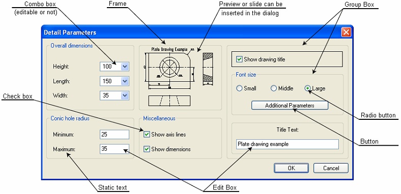
The control elements "Static text", "Frame" and "Group Box" are not related to any variables and are used for making a clear dialog layout and providing hints.
Static Text is a text string positioned in the specified area of the dialog box.
Frame is a rectangular frame or rectangular area of the specified color. By default, this is a black frame or a rectangle of the background color.
Group Box is a frame with a text aligned with the top border of the box.
The two last elements are used for enhancing and structuring the visual appearance of control elements in the dialog box. Other visual means can also be used for this purpose.
Other elements – "Edit Box", "Button", "Combo Box", "Check Box", "Radio Button", "Preview" - are related to variables or the model pages and is intended for manipulating those in certain ways.
Edit Box is a rectangular field for editing the value of the variables associated with this box. Edit box is used for variables without lists of predefined values. It is possible to work in a mode when the displayed value cannot be edited (in this case, in the Edit Box field the value of the connected to this field variable will be shown but this value will not be possible to modify).
Button. A button defines the sequence of actions performed upon pressing it. Such actions can be:
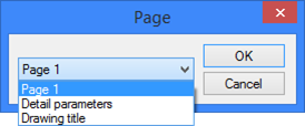
- Activate Page (show contents of the specified page in the current dialog box);
- Open Dialog Box (displays the dialog box contained on the specified page, in a new window);
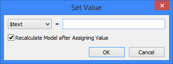
- Set Variable Value (assigns the specified value to the selected variable).
- Regenerate 3D Model.
- Run Macro (a macro is a program written in some programming language using T-FLEX CAD API functions. See the "Macros" chapter for details or creating and working with macros).
-Open document (open document of T-FLEX CAD);
-Edit fragment’s variables (open the edit dialog for variables of the specified fragment);
-Run the command (it is a tool for applications developers; the application identifier and the name of the command that processes this application are specified. When clicking on the specified application, the call with the command’s name is initiated).
Combo Box is a rectangular field with a pulldown list button  on the right. A combo box is used for modifying a variable value when there is a predefined list of values. The element parameters define whether it is possible to edit the input value.
Check Box switches between the two values of the selected variable. The particular value depends on the check box state.
Radio Button switches between the variable values defined in the radio group parameters. Radio buttons can be conveniently used for variables with several fixed choices of values. (In the case of just two choices, "Check Box" can be used instead.) In this case, a radio group of switches is created for the variable, each representing one of its values.
The custom dialogs allow creation of "Preview" controls. Such an element allows displaying a preview pane for a page per the specified fixing factor in the dialog box for editing the fragment external variables. Preview is not available in the dialogs called by the command "Parameters|Model".
When creating a dialog box, besides the control elements proper, you can use any drawing elements: nodes, construction lines, images, pictures, etc. Construction lines and nodes are not displayed as part of the dialog box window, however, those can be used for precise positioning of control elements when creating complicated dialogs.
Graphic elements and pictures can be used as additional detailing elements in the dialog box along with the standard control elements, such as "Frame", "Group Box", "Static Text". Those elements can be used, for example, for creating a simplified parametric drawing on the page of the dialog box. In this way, the user can evaluate the changes made to the model parameters by this drawing.
Dialog pages
All control elements of a dialog should be located on one page. Dialog elements can be placed on a drawing page or on an additional manually created page. However, we recommend placing control elements on a separate page of "Controls" type, created automatically. Such page is assigned "Custom" format with the paper height and width recommended for dialog boxes, as well as optimum font size and grid step for dialogs.
The dialog box size is defined by the value of the parameter "Paper size" in the command ST: Set Document Parameters (the tab "Paper"), defined for the dialog page. The size of the dialog box can be modified via the parameters of the mentioned command or by using the command "Customize|Page Size".
For automatically created "Controls"-type pages, grid display is turned on for easy positioning of control elements. To turn off the grid or to change its step, use the command "Customize|Grid". If necessary, you can turn on snapping to existing 2D nodes or use the absolute coordinates.
The dialog box can be used in the future for editing the model external variables. Therefore, the automatically created dialog page is added for convenience to the list of pages on the tab "External Variables" of the command "ST: Set Document Parameters". You need to switch the parameter "External variable editor" to the option "Control", and check mark the created dialog page in the list of pages.
The page name will be used as the dialog box title. The page name can be modified using the command "Customize|Pages…" or with the help of the command “Rename” found in the context menu for the tab of the given page.
Multipage dialogs
A T-FLEX CAD document may contain an arbitrary number of dialog pages. You can build separate dialogs for various groups of parameters and specify different scenarios of the dialogs interaction. The two main scenarios of the dialogs interaction are as follows:
Complex multi-tab dialog box. Separate dialog boxes are joined into a complex one with tabs, each tab corresponding to a particular contributing dialog box;
Main-subordinate dialog scheme. In this scheme, one of the dialogs is rendered main and appears upon calling the command "Parameters|Model", while the rest of the dialog boxes are called, if necessary, via the controls of the main dialog.
The combination of the two schemes is also possible.
When creating a dialog box with tabs, keep in mind that the pages of the dialogs being joined must have same size. Otherwise, all pages and their respective elements will be forced to scaling to the size of the first one.
The second scheme that relies on using several dialog boxes allows different page sizes.
General principles of creating control elements
To create a dialog box, use the command "Create Control". It can be called by one of the following means:
Icon |
Ribbon |
|---|---|
|
Parameters → GUI Control → Control |
Keyboard |
Textual Menu |
<TR> |
Draw > Control |
Upon calling the command, the following options become available in the automenu:
 <S> Create Dialog Page
 <F> Frame
 <T> Static Text
 <E> Edit Box
 <G> Group Box
 <B> Button
 <C> Check Box
 <R> Radio Button
 <O> Combo Box
 <V> Preview
 <P> Edit Control Parameters
 <A> Set absolute coordinates
 <N> Set relation with Node
 <F4> Edit Control
 <Esc> Exit command
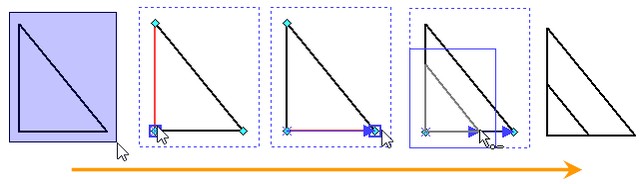
Creation of All control elements can be fit in the following scheme:
1. Defining the size and position of the element being created. This is done by specifying two diagonal points of the box defining the element extents on the dialog page.
2. Defining the element parameters in the "Control Parameters" dialog box. This dialog is launched automatically.
3. Defining additional parameters - of the variable bound to the control, or of the sequence of actions performed upon activating the control.
Depending on the type of the control, some of the steps in this scheme can be skipped. For example, when creating the "Frame" and "Preview" controls, all you need to specify is the position. Other parameters of these controls are defined by default. To modify those, you can use the control editing command described in the section "Modifying control elements". Additional parameters need to be defined only for the elements "Edit Box", "Combo Box" and "Button".
Parameters of control elements
Control elements, just like any other T-FLEX CAD elements, have a set of parameters. Some of the control element parameters belong to general system parameters: "Level", "Layer", as well as font parameters. The default value of the "Level" parameter is "0", the parameter "Layer" – "Main", the font parameters – "By default".
The general parameter "Priority" is assigned automatically in the process of control element creation, reflecting the order of creation: the first control is assigned priority "0", next – "1", etc.
Besides the general system parameters, control elements have a set of additional parameters:
Caption (the text displayed on the control);
Color of characters (in the cases of "Frame" and "Preview" – the color of the frame strokes or the box background);
Background Color of the control element (for the element "Group Box" – the background color under the group name);
Horizontal Alignment;
Vertical Alignment.
The two latter parameters define the caption text position with respect to the control element boundaries.
Some of the above-mentioned parameters are omitted in certain control elements. For example, the "Button" control omits the parameter "Background Color", while the "Group Box" does not require the parameter "Vertical Alignment", since the group name is always positioned along the top boundary. Note that, when defining parameters of a particular control element, only its relevant parameters will be accessible in the "Control Parameters" dialog box.
Some control elements also have their own specific parameters:
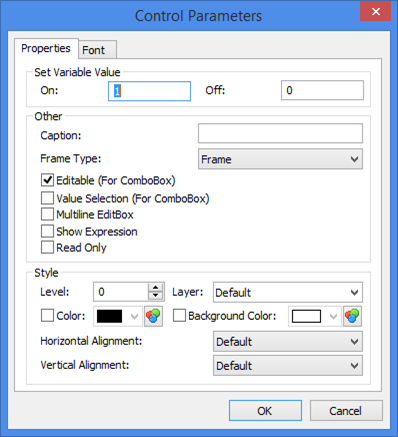
Frame: Frame Type: frame or rectangle. Edit Box: Multiline EditBox – used for text variables only. Permits entering multiple lines. Show Expression. This parameter affects custom dialogs when using variables. Usually, names of the variables are not displayed in the dialog boxes, when such variables or expressions are used as parameters of the fragments being inserted into assemblies. This option outputs name of a variable in edit fields of the dialog boxes. At the same time variable’s value or expression is displayed nearby. Read Only. When this flag is turned on, the editor will work in a regime “read only”, i.e., in the Edit Box field the value of the connected to this field variable will be shown but this value will not be possible to modify. Combo Box: Editable – allows direct input of variable values without selecting from the list. Value Selection. Option is used for binding external variables between each other. For example to select the thread pitch from list, according to the thread diameter, automatically. If the option is not activated, the thread pitch will not change according to diameter.
Check Box: On – defines the value assigned to the variable when the box is checked; Off – the value assigned to the variable when the box is cleared. Radio Button: On - defines the value to assign to the variable when switched on. |
|
In the further description of the controls, only the elements will be mentioned that are specific to this control element.
Dialog box creation
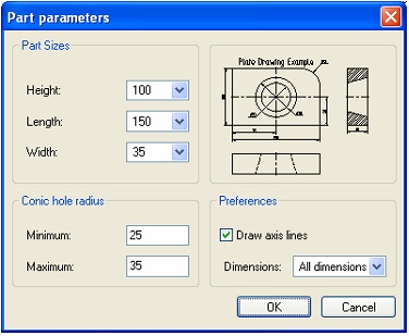
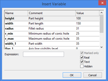
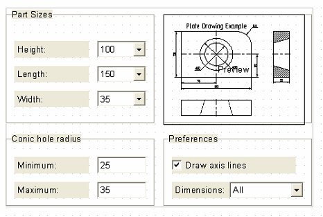
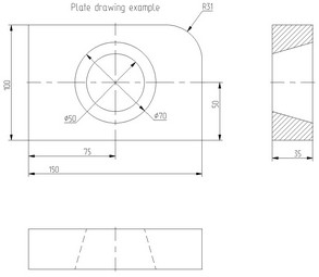
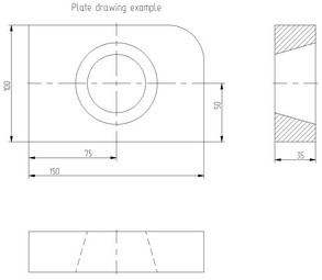
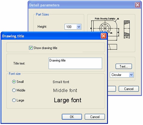
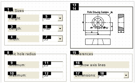
Let's review the process of creating a dialog box using the example. The files for the examples described in the present chapter are located in the library “Examples” in the folder “\T-FLEX Parametric CAD 15 \Libraries\Examples\Parametrization\Control”. The drawing being considered is stored in the file “Sample plate drawing.GRB”. To modify parameters of the drawing, let's introduce a set of variables: The variables height, width and width_1 are used as parameters of the lines defining the part dimensions;
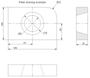
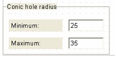
The variables r_min and r_max define the radii of the conic-shape hole; flag_1 defines the visibility level of the axes; flag_3, size and $text define, respectively, the visibility level, the font size and the drawing title text; flag_21 and flag_22 define, respectively, the visibility levels of the linear dimensions and the circle-referencing dimensions. Their values are driven by the variable dim_mode that controls the type of the displayed dimensions (none, linear only, circle dimensions only or all dimensions).
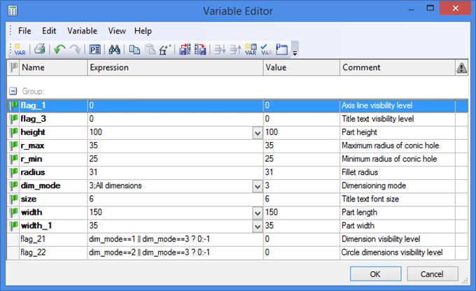
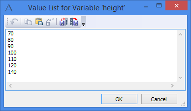
All variables, except flag_21 and flag_22, are external. Predefined lists of values are created for the variables height, width and width_1, and dim_mode. Note that the variable dim_mode uses a list of a special type: each numerical symbol is separated by ";" from the string bound to this numerical value. How to use such a list is described below. The introduced variables allow getting different versions of the original drawing: modifying the part size and the size of the hole, displaying axes and various dimensions.You can also modify the font size of the title, or hide it altogether.
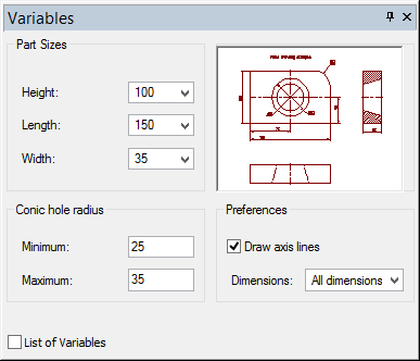
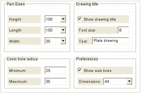
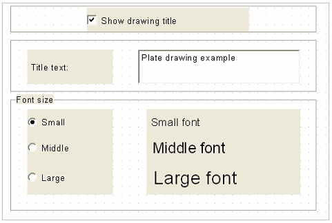
Let's consider various choices of the dialogs for this example. Let's begin with creating a simple dialog for this model, as shown on the diagram. The respective library file is "Sample single dialog.GRB".
The dialog being created allows modifying the part size and the size of the conic hole and showing/hiding dimension and axis display.
Call the command "TR: Create Control".
Let's create the dialog page:
 <S> Create Dialog Page
By default, the newly created page is assigned the type "Controls", with the recommended sizes set appropriately. This page is also automatically added and check marked in the list of pages displayed by the command ST: Set Document Parameters (the tab "External Variables"), while the parameter "External variable editor" is switched into the mode "Controls". Name the new page "Part parameters". Grid snapping is turned on this page by default.
You can also turn on snapping by the absolute coordinates:
 <A> Set absolute coordinates
When using construction lines and nodes, you can use snapping to 2D nodes:
 <N> Set relation with Node
If necessary, you can define default parameters for all newly created control elements:
 <P> Edit Control Parameters
Calling the option <P> brings up the "Control Parameters" dialog box. The latter provides the full set of parameters for a control element. Thus, in our example, the parameter "Editable" can be turned off for "Combo Box"-type controls.
The variables of the model, whose values will be controlled by the dialog being created, can be divided into several groups:
Variables that drive the part sizes (height, length, width);
Variables that drive the size of the hole (minimum and maximum radii);
Variables that control axis and dimension display.
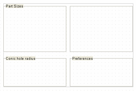
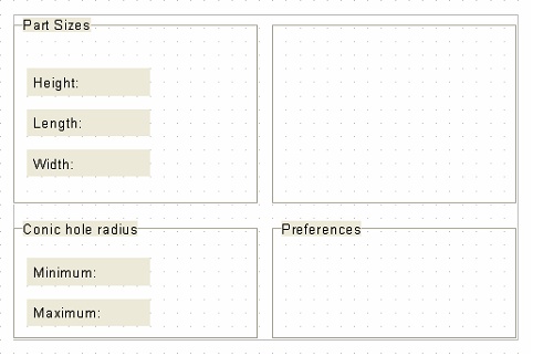
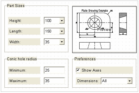
Let's divide the dialog box accordingly into several theme areas. In the first area, let's put the control elements for modifying the "Part Sizes". The second area will hold the controls for defining the "Conic Hole Sizes". The third area will contain the control elements for axis and dimension display "Preferences". Finally, the fourth group can unite auxiliary elements: the preview pane (for selecting the active page when inserting the drawing as a fragment) and the picture of the drawing (to display when modifying the model parameters in the command "Parameters|Model").
The "Group Box" control element will be used for enhanced visual representation/grouping of the control elements in the dialog box being built:
 <G> Group Box
Create the first group on the dialog page. Set the size and position of the element as shown on the diagram. In the "Control Parameters" dialog box, enter the group name as: "Part Sizes". Thereafter, create the rest of the groups in the same way. Position the groups as shown on the diagram. Note that the group reserved for the preview pane is left unnamed. To have it this way, leave the "Caption" entry blank in the "Control Parameters" dialog. The element "Frame" can be used for similar purpose.
Thus, we have created group boxes for various model parameters. Now, we need to create control elements within each group, that will allow modifying the values of the respective variables.
Let's create explanation notes. To do this, select the automenu option:
 <T> Static Text
To create a string of text, specify two bounding points of the text.
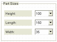
In the coming up "Control Parameters", enter the string "Height:" in the "Caption" parameter input box. Similarly, create the captions "Length:", "Width:" and "Minimum:", "Maximum:", placing those as shown on the diagram. Next, we need to create control elements for editing certain model parameters. The control elements "Edit Box" and "Combo Box" can be used for this purpose. Since the lists of predefined values exist in this example for the variables height, width and width_1, responsible for the height, length and width of the part, respectively, let's use the "Combo Box"-type controls for these variables.
Since the parameter "Editable" is turned off in the default settings, the direct input of the variable values is disallowed for all created "Combo Box" controls in this example. The variables can only be defined by selecting values from the list.
First, let's create the control element for defining the part height. Call the respective automenu option:
 <O> Combo Box
Position the control to the right of the "Height" caption, as shown on the diagram. Next, in the coming up "Insert Variable" dialog box, select the variable to bind to the control being created (the variable "height" in the case of the part height).
If necessary, you can specify the name of any non-existent variable by manually entering it in the "Expression" field. This brings up the standard "Variable value" dialog box. The variable being created is automatically marked as external.
Create yourself the "Combo Box"-type controls for the variables "width" and "width_1".
The next step is creation of control elements for modifying the variables r_min and r_max that drive the size of the conic hole. Since these variables do not have predefined lists of values, you can use "Edit Box" controls for them:
 <E> Edit Box
Let's create the "Edit Box" of the variable r_min. Activate the option and define the control position according to the diagram. In the "Insert Variable", select the variable to bind the control to – r_min. Similarly, create "Edit Box" for the variable r_max.
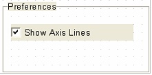
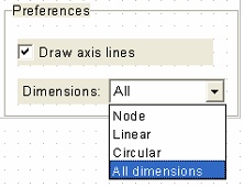
To make the selector for axis display, in this example one can use the "Check Box" control, placing it in the "Preferences" group.
Select the automenu option:
 <C> Check Box
As in the case of any control elements, the first step of creating the switch is selecting two points for defining the switch position. Next, the "Insert Variable" dialog box appears. Select the variable flag_1 from the list. The "Control Parameters" dialog box then comes up automatically.
In it, you need to define the respective variable values for "On" and "Off" states. Since the variable flag_1 in our example defines the visibility level of the axes, the "On" state corresponds with "0", while "Off" – with "-1". In the "Caption" input box enter the string "Show Axis Lines". We will use another "Combo Box" control for managing the dimension display options, bound to the variable dim_mode.
Place this control in the "Preferences" group box. Note that, with the flag "Editable" turned off, the described combo box displays in its value field and the pulldown list the textual string portions defined in the values list of the variable dim_mode, rather than the numerical values. Put the explanation text "Dimensions:" before the "Combo Box" control, using the "Static Text" element. The remaining empty space on the dialog page can be used for placing a picture or preview pane.
Let's insert a picture in the dialog, illustrating our model. Save your model as a picture, using the command "EX: Export". After that, add the created image to the dialog page, using the command "IP: Insert Picture", and place it in the empty group box. Use "File | Assembly | Links" command for breaking link between a picture and the corresponding file. Set "Embedded" flag for the respective item.
The "Preview" element can be placed on top of the picture.
To create it, select the option:
 <V> Preview
Specify two points defining the size and position of the preview pane. In this example, align the preview pane boundaries with those of the group box hosting the picture. The "Preview" element should fully cover the picture. From now on, when inserting this drawing as a fragment, there will be a preview pane in the dialog box. In this way, both the picture and its hosting group will be screened by the preview. However, when calling the dialog by the command "Parameters|Model", the preview pane will not appear, exposing the underlying picture.
Now, all dialog controls are created. To insure that the transition from one to another control in the dialog follows the desired order (as, for instance, when using the <Tab> key), we need to define the activation sequence of the control elements while working with the dialog. This can be done using the control element editing command "EO: Edit Control" described in the section "Modifying Control elements".
Thus, the dialog creation is complete. In the course of creation, you learned how to create a dialog page and control elements for decorating the dialog box and modifying the values of the external variables.
Use of the dialog
As was mentioned above, the created dialog box can be used for defining the model parameters and when using the model as a 2D or 3D fragment.
In the first case, the command "Parameters|Model" is used for launching the dialog box. Upon calling the command, the newly created dialog appears on the screen, allowing to modify the values of the model variables. Modifying a parameter in the dialog box instantly reflects on the part drawing. However, the image on the picture does not change since it is not parametric to our model. Try changing the dimension display mode: set the parameter "Dimensions:" to the value "Linear". The drawing will adjust to this setting as shown on the diagram. To finish working with the dialog box, you need to press [Ok].

When inserting the model as a fragment, the created dialog box becomes part of the fragment parameters dialog box. To verify that, save the resulting model using the command "File|Save". Then open a new document using the command "File|New 2D Model". Call the fragment creation command "Draw|Fragment" and select the automenu option  . In the coming up window find the file of your example. The fragment parameters dialog box will then display the created dialog. By default, the user-defined dialog of fragment parameters will be a part of the general dialog of parameters of fragment insertion command. By pressing
  at the upper right corner of the parameters dialog, the dialog can be shown in a mode of viewing in a separate window.
Note that the preview pane now appears in the dialog box, screening out the picture. All changes done to the model parameters using the dialog controls will be reflected in the preview pane. The preview pane also displays the selected drawing page and the fragment fixing vectors present in the model.
The control elements that make up the dialog can be used for modifying the model external variables directly in the 2D window, without calling the command "Parameters > Model" or "Draw >Fragment". In this way, working with the dialog page is similar to working with the actual dialog box when the latter comes up on the screen.
Thus, upon clicking  on the "Button" control, all functions defined for this control elements are activated from the dialog page. Upon clicking on the elements "Edit Box" and "Combo Box", one can manually define or select from the list a new variable value. Clicking changes the states of the "Radio Button" and "Check Box" control elements.
To finish inputting changes, you can press  , <Enter> or over any empty area on the dialog page. The entered changes can be canceled by pressing
  , <Esc> or
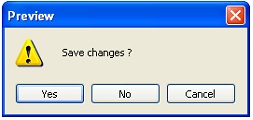
  . In this case, a confirmation window will appear, double-checking about the cancellation.
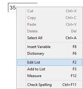
A "Combo Box" control allows an additional manipulation. If it is bound to a variable whose predefined list is based on a file, then you can modify this list directly in the dialog page by turning on the "Editable" parameter. To do this, point the mouse to the input box of this control and access the context menu. Commands will be provided in the context menu for modifying the list of predefined values of the variable. Upon selecting the command "Add to list", the value entered in the input box is added to the list of values for this variable. Selecting the command "Edit list" brings up the "Value list of variable" dialog box, that allows editing the existing list.
Parametricity of custom dialogs
In the course of reviewing this example, it was mentioned that control elements, just like other T-FLEX CAD elements, possess general system parameters "Level", "Layer", etc. This allows creating parametric dialogs, whose appearance changes depending on the kind of a model.
As an illustration to this statement, let's continue with the current example. Let's create a modification of the dialog. The respective file in the library of samples is "Sample parametric dialog.GRB".
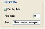
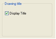
Delete the elements "Preview" and "Picture" from the dialog page. Then select the group box of the deleted elements and double-click . In the coming up "Control Parameters" dialog box, modify the group box title by assigning the parameter "Caption" the string "Drawing Title". Let's place in this group box the control elements for handling the drawing title. The variables "flag_3", "size" and $text will define, respectively, the visibility, size and text string of the title. To control the title visibility, the variable flag_3 needs just two values ("0" when the title is displayed, "-1" – title hidden). Therefore, let's create a "Check Box" control element for this variable.
Position the control as shown on the diagram. In the window "Insert Variable", select the variable flag_3. In the "Control Parameters" dialog box, assign the "Caption" parameter the string "Display Title". Enter the value "0" for the parameter "On", "-1" - for "Off".
Next, let's create control elements for defining the title font size. Since the variable "size" does not have a list of values, one can use an "Edit Box" control. In the window "Insert Variable", select the variable "size". Put the explanation text "Font size:" before the control, using the "Static Text" element.
The next step is creation of control elements for modifying the title text.
The variable $text can be conveniently controlled by an "Edit Box" element as well. To provide support for defining a multiline title, turn on the flag "Multiline EditBox", using the option  . Then specify the element position and select the variable $text in the "Insert Variable" window.
To go to the new line in the multiline editor, use the key combination <Shift><Enter>. The control sequence "\n" can be used for separating lines as well.
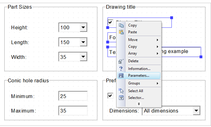
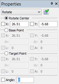
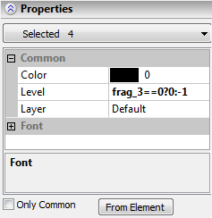
Put the explanation text "Text:" before the "Edit Box" control, using, as before, the "Static Text" element. Thus, we have created the interface for controlling the title text in our dialog. However, it is not yet parametric. Let's modify it in such a way that the control elements for modifying the font size and the title text string were displayed in the dialog only when the flag "Display Title" is turned on. To get this, let's relate the "Level" parameter of the relevant elements to the variable flag_3. Select by box the font size and the title string control elements and click .
In the context menu, select the item "Parameters…". The dialog for editing properties of the selected elements will appear in the properties window. In this dialog, clear the marks against all parameters except the "Level" parameter, and assign the latter a new value: flag_3 == 0? 0:-1. Click  . The entered expression means: if the variable flag_3 is equal to 0, then the parameter "Level" will be assigned the value 0, otherwise - (-1). Thus, the dialog is created, and we can call it by the command "Parameters|Model". Calling the command brings up this dialog box on the screen.
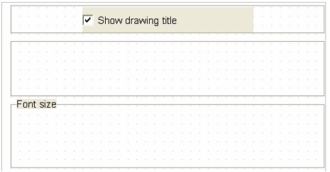
When the flag "Display Title" is turned on, the parameters "Font size:" and "Text:" are present in the dialog. If the "Display Title" flag is off, the controls for defining the font size and the title text string are omitted in the dialog.Therefore, the created dialog box sample has parametric properties. One can create various parametric dialogs of more complex structure, using the same principle.
Working with multiple dialogs
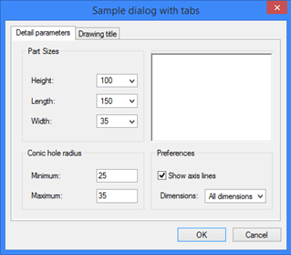
As was mentioned above, multiple dialogs can be created within one model. Let's get back to the dialog instance with a preview pane and a picture. In addition to the existing dialog, let's create a dialog with controls for the title of the drawing. The file of this instance is "Sample dialog with tabs.GRB".
Call again the command "TR: Create Control". Using the option  , create a page for the second dialog. Rename it with the help of the command "Pages", setting the name "Drawing title".
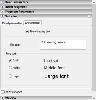
As it was mentioned, the variables "flag_3", "size" and $text control the visibility, size and the contents of the drawing title text string, respectively. For each variable's control element, let's create the three respective "Group Box" elements, as shown on the diagram.
As before, create a "Check Box"  for switching the values of the variable flag_3. Place this control inside the first group, as shown on the diagram. In the window "Insert Variable", select the variable flag_3. In the "Control Parameters" dialog box, assign the parameter "Caption" the string value "Display Drawing Title". Set the parameter "On" to "0", "Off" – "-1".
We will use the "Edit Box" control for modifying the title text, with the flag "Multiline EditBox" turned on.
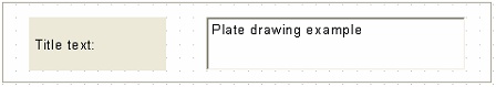
We need to put the explanation text "Title Text:" before the "Edit Box". To do this, use a "Static Text" element.
Finally, let's create the control elements for defining the title font size. Those will be placed in the group box "Font size".
We will pre-define three choices: small font (size=6), medium (size=8) and large (size=10). For controlling the value of the variable "size", we will use three "Radio Button" elements: one per each value of the "size" variable.
Call the option:
 <R> Radio Button
Specify the position and the size of the switch. In the "Insert Variable" window, select the variable "size". In the parameters dialog box set the "On" parameter value equal to "6" and the parameter "Caption" as "Small". Similarly, create another two "Radio Button" controls, positioning those exactly beneath the first one.
Their related variable should also be "size". The "On" parameter settings for these elements should be "8" and "10", respectively. The name of the second switch is – "Medium", the name of the third one – "Large". One can put "Static Text"-type control elements next to the switches to provide explanation, mentioning the respective font size of the text (6,8 and 10) in the "Control Parameters" dialog box on the tab "Font". Once all the control elements are created, make sure to check their activation order.
Thus, a second dialog is created in the model – the one for controlling the title of the drawing.
Next, we need to decide, how the two dialogs will interact. Since the option  was used for their creation, both pages were automatically added and check marked in the page list of the command ST: Set Document Parameters (the tab External variables). Meanwhile, the parameter External variable editor switched to the mode Control.
In this case, the dialog pages will be automatically joined into one dialog box with tabs. The tab names will be the same as the names of the pages. The first tab will correspond to the first page, the second tab – to the second page, respectively.
However, there is another way of using multiple dialogs.
Consider one dialog as main. Then this dialog will be launched by the command "Parameters >Model" or when inserting the fragment. Other dialogs can be called, if necessary, using the "Button"-type control elements of the main dialog.
Let's consider this possibility in our example. Select the "Part parameters" dialog box as main. To do this, in the command ST: Set Document Parameters (the tab "External Variables") clear the checkmark on the page "Drawing title". Now, upon calling the command "Parameters > Model" or while inserting the fragment, only the dialog "Part parameters" will be displayed.
The second dialog will be called by one of the controls of the "Part parameters" dialog box. Let's create a button as such a control. Place this button in the "Preferences" group box. Note that the dialog page is already fully occupied by the existing control elements. To fit the button, let's reduce the size of the "Check Box" element for the variable flag_1. Change the "Caption" property of this element from "Show Axis Lines" to "Show Axes". To create the button, again call the command "TR: Create Control".
Select the automenu option:
 <B> Button
As was mentioned, this option allows creating a button control on a dialog page and define a sequence of actions performed upon pressing the button. The first step of button creation is defining its size and position in the dialog box. Next, in the "Control Parameters" dialog box, define the button parameters. Then, the "Actions" window appears. Here we need to specify the action (or a sequence of actions) to be performed upon pressing this button. Adding actions to the list is done as follows. In the pulldown list of actions select the desired one and press [Add…] button. Then, depending on the selected choice, an appropriate dialog box will appear for selecting a page or variable and the value to be assigned to it. After that, the action is added to the list of actions of the button being created. To make changes in the specified list of actions in the "Actions" window, use the following graphic buttons: To delete an action - select the desired line in the list of actions and press the button [Delete]. To modify an action - select the desired line in the list of actions and press the button [Properties…]. (A dialog box will appear for selecting the page or variable and for specifying its value.)
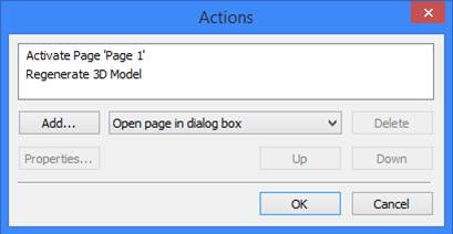
To change the order of actions (which is the same as their order in the list) - select the necessary line in the list of actions and move it, using the buttons [Up] or [Down].
When pressing the button, the actions of performed in the order in which they were defined. Therefore, the order of actions is defined according to the purpose of the button creation. In addition, keep in mind that if the action sequence involves calling a dialog box, the remaining actions will be performed only after closing this dialog box by pressing the [OK] button. If the dialog call ended in pressing the button [Cancel], the remaining actions are ignored.
For the current example, define the position of the button on the dialog page as shown on the diagram.
In the "Actions" window, define the following sequence of actions:
1. Assign the variable: $text="Drawing Title";
2. Show the "Drawing title" dialog.
After creating the button, call the command "Parameters|Model". The "Part parameters" dialog box will appear. Press the graphic button [Text…]. The "Drawing title" dialog window opens. The title text changes to "Drawing Title". To return to the main dialog, just press the [OK] button.
In this way of dialog interaction, the dialog box sizes can be different. Let's reduce the "Drawing title" page size using the command "PZ: Set Paper Size".
The two latter examples are represented in the library of samples by the files "Sample compound dialog with constant size of pages.GRB" and "Sample compound dialog with variable size of pages.GRB".
Control elements modification
To modify control elements, the control editing command is provided, "EO: Edit Control"
Keyboard |
Textual Menu |
Icon |
<EO> |
"Edit|Draw|Control" |
|
The control editing command can also be called from the context menu.
Upon calling the command, the following options become available in the automenu:
 <*> Select All Elements
 <R> Select element from list
 <T> Change Controls Tab Order
 <S> Set Recommended Page Parameters
 <Esc> Exit command
The option  is used for assigning default parameters of a dialog page to the current page (those set at creation by the option
  ). The page being modified is assigned the type "Controls". This page is automatically check marked in the list of pages under the "External variable editor" parameter in the command "ST: Set Document Parameters". The parameter itself switches to the "Pages" setting. The option is used on the pages created or modified by using the commands "Customize > Pages…", "Customize > Page Size" or "Customize > Grid ".
The option  allows changing the order of control element activation.
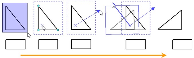
Control elements have a certain order that defines transition to the next element upon pressing the keys <Tab> and <Shift><Tab>, and priority, that defines the order of overlapping of the control element images. By default, both properties are assigned according to the order of element creation. That means, the transition will occur from the first created element to the next one, while the priority of each element is higher than that of the previous, and lower than that of the next one.
Upon calling the option  , the order number is displayed next to each control element. If you need to change the order of elements, select them in the desired order. To confirm the changes, press the icon
  or <Enter>. If you made a mistake when defining the order of elements, press
  or <Esc>, and then select the option
  again.
To modify a control element (or a group of elements), select it by clicking (you can also use box selection, <Shift>+ for multiple selections, selection by name from the list using the option 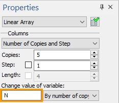 , or selection of all elements on the page by the option
 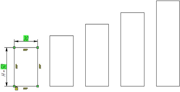 ).
).
If selecting a single element, you can modify its size. To do this, simply point the mouse to the border of the element rectangular area. The pointer shape changes to  . Dragging the mouse with depressed changes the size of the selected element.
To move the selected element (group of elements), simply point the mouse inside the element rectangular area. The pointer shape changes to  . Dragging the mouse with depressed changes the position of the selected element.
Upon selecting an element, you can use the following options (the full set of accessible options depends on the element type):
|
<P> |
Edit Control Parameters |
|
<V> |
Change Control Variable |
|
<Y> |
Create Name for selected Element |
|
<A> |
Edit Actions List |
|
<I> |
Select Other Element |
|
<Del> |
Delete selected Element(s) |
|
<Esc> |
Cancel selection |
The option  is only accessible for the control elements that are bound to variables. This option allows reassigning the variable, whose value is controlled by the selected element (all steps in this case are the same as when creating the control element).
The option  is only accessible for the "Button"-type control elements. It allows adding/deleting the actions to perform when pressing the selected button.
The option  calls the property window of the selected control element. For "Frame", "Group Box", "Static Text" and "Preview" elements, this window can be called by double-clicking . In the case of multiple selections, the option
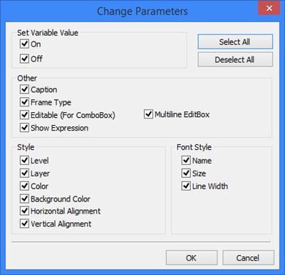
  first brings up the "Change parameters" dialog box. In this dialog box, you need to mark the parameters to be edited. By default, all parameters of the selected elements are subject to editing. If a parameter should not change, clear the check mark before its name. Upon specifying the set of parameters to be edited and pressing [OK], the standard dialog box appears for defining the parameters of the selected elements. The parameters that cannot be modified are made inaccessible. Note that some general parameters ("Layer", "Level", etc.) can be edited using the system toolbar.